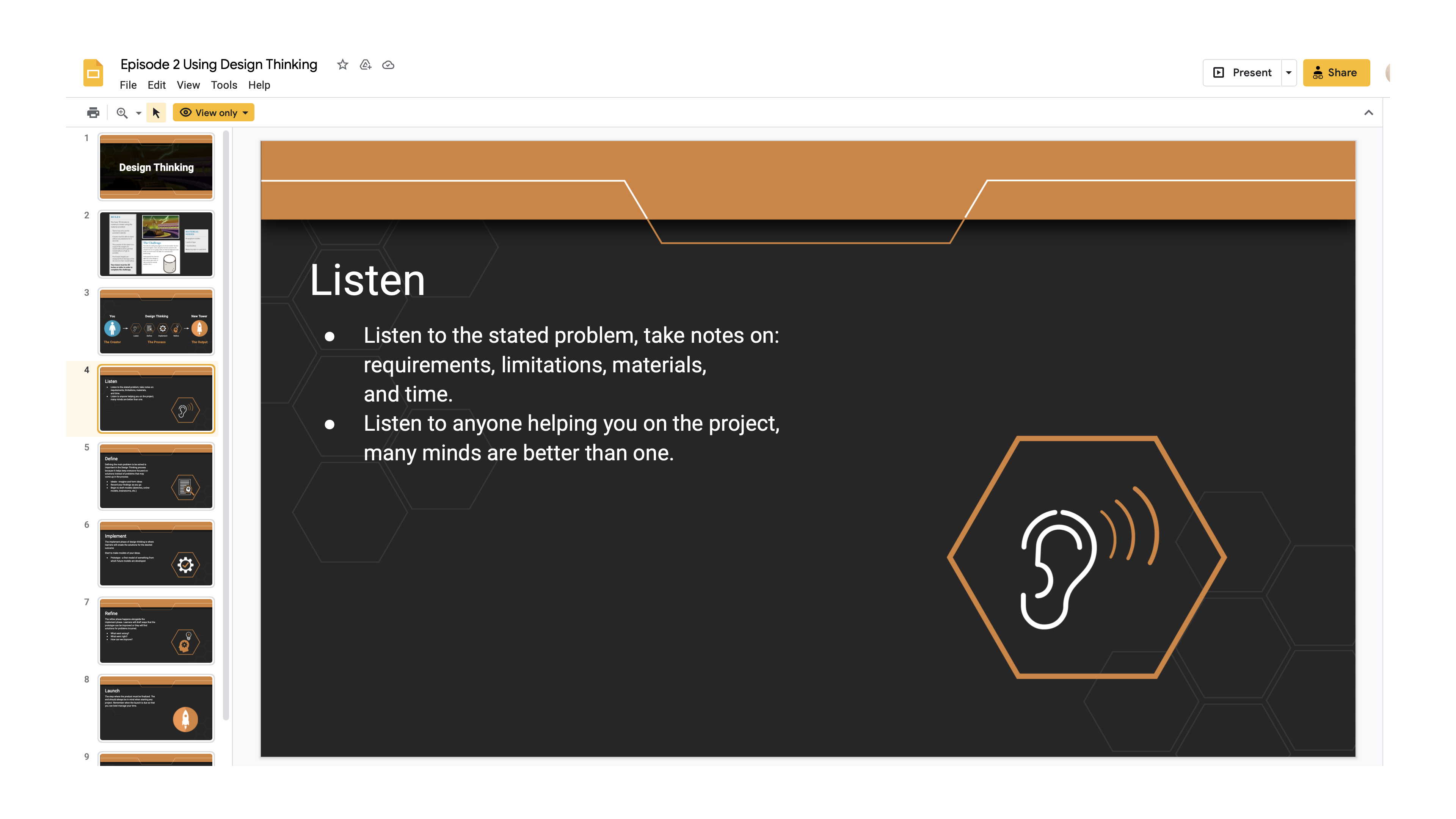
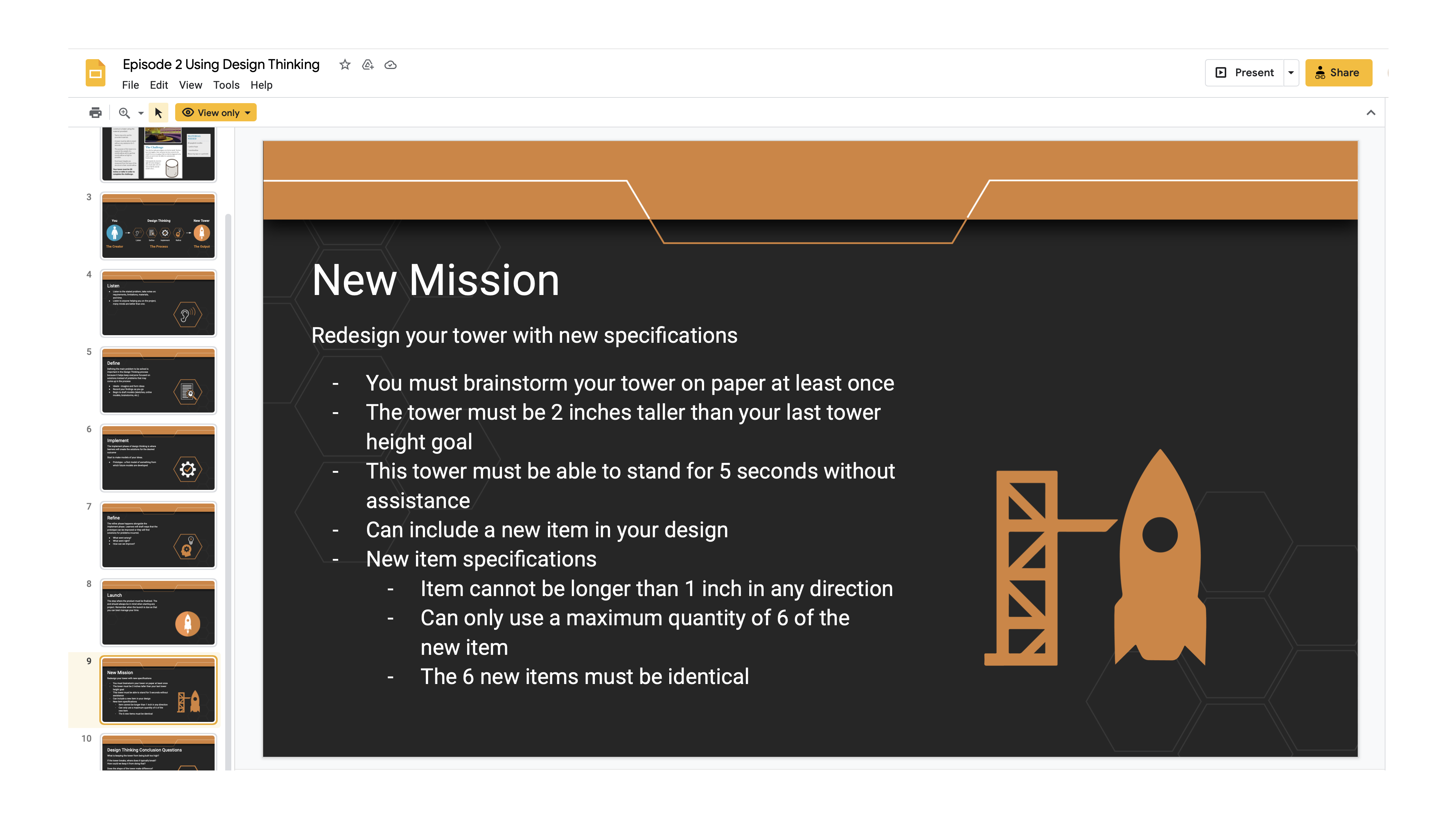
Presentation layout
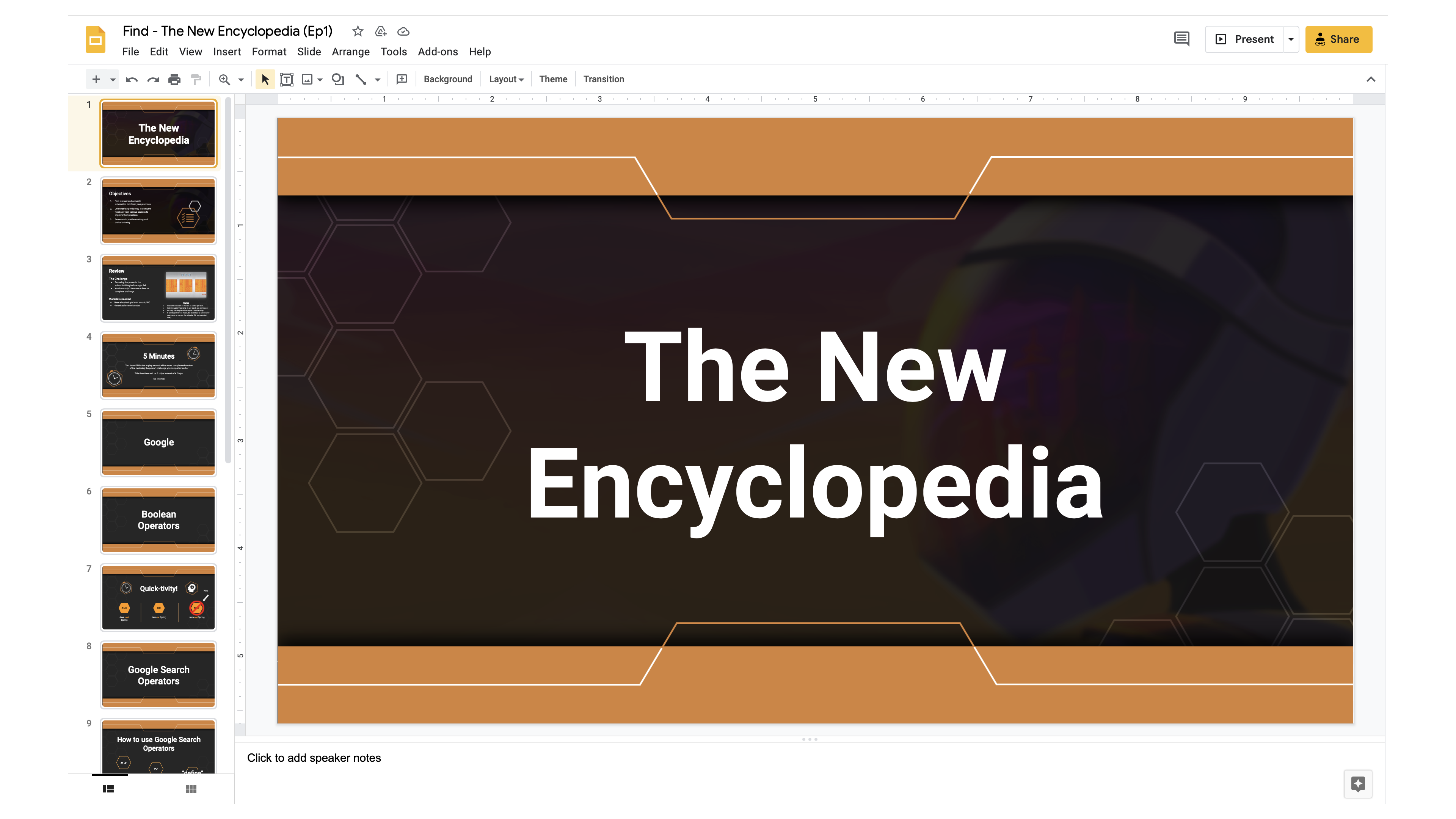
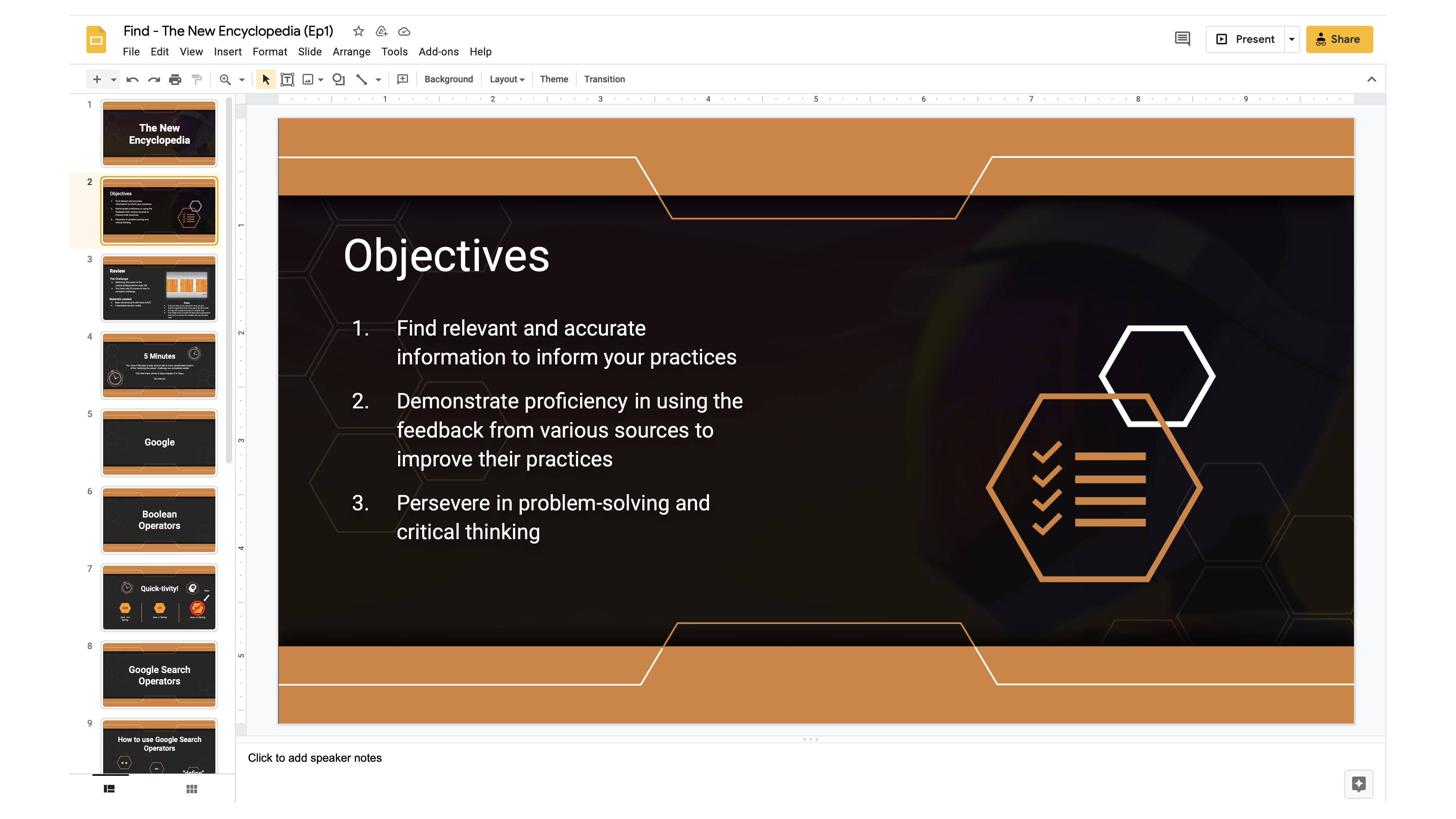
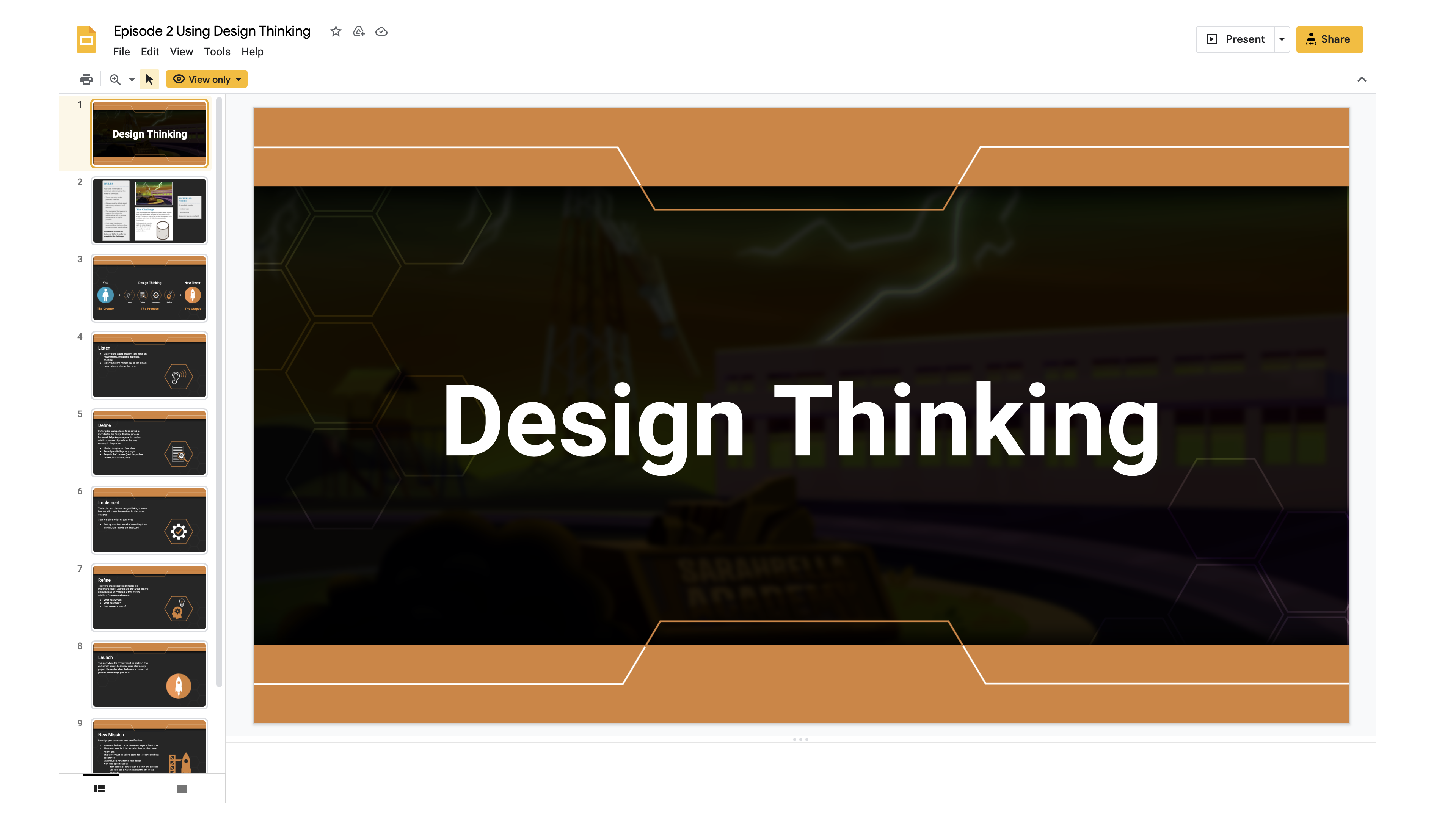
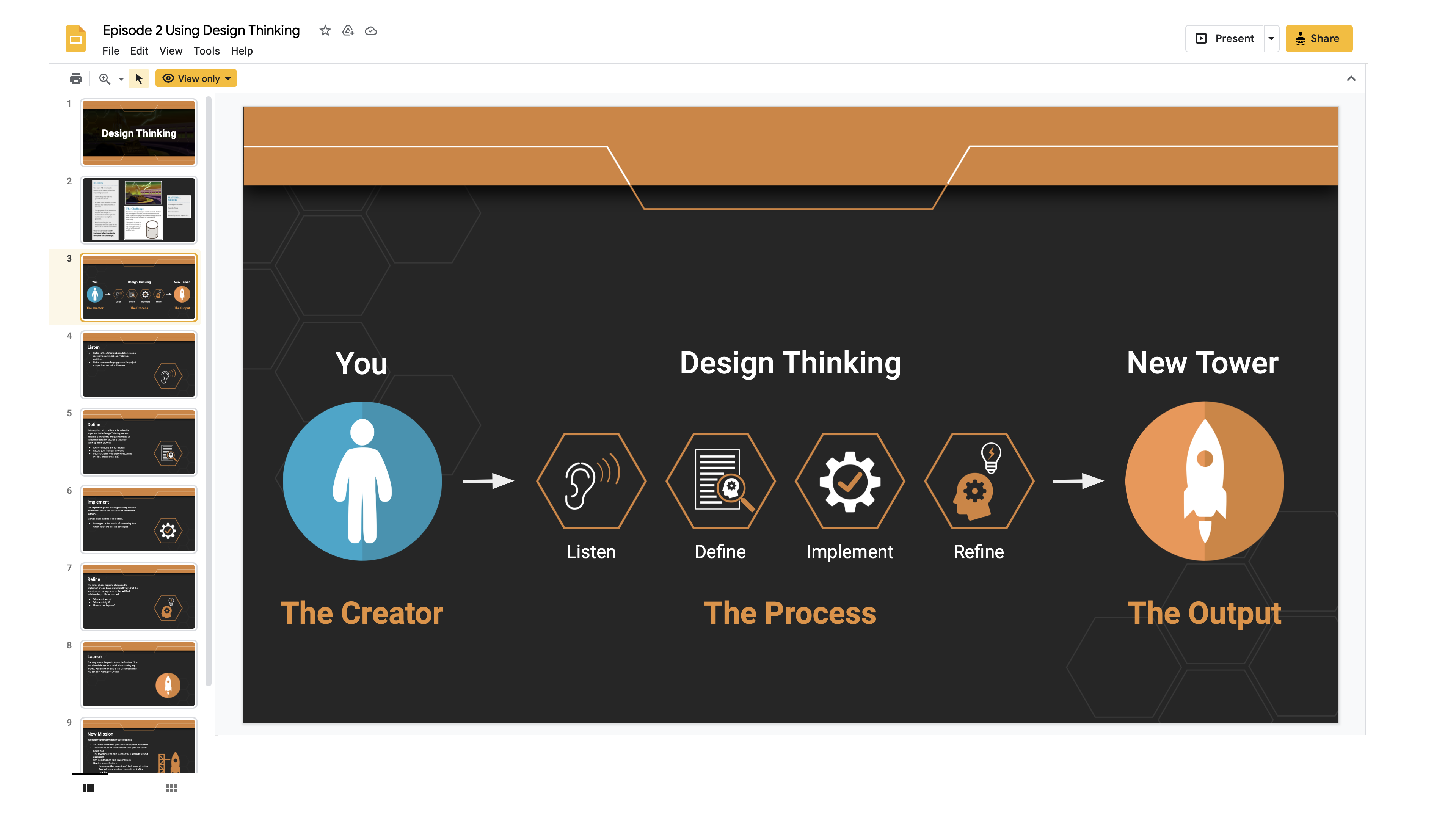
This presentation design was for an educational organization called quest, who would be presenting to tutors and eventually students. The manager needed some revamping on their presentations slides. Since it was going to be episode driven, consistency was important. The client had existing art that I could reuse, so I sketched out my ideas, created the layout, composed original icons and helped upload it onto their presentation platform. Below are snippets of how the presentation slides looked like and the template slides prior to adding text.
Please feel free to click each image to take a closer look.
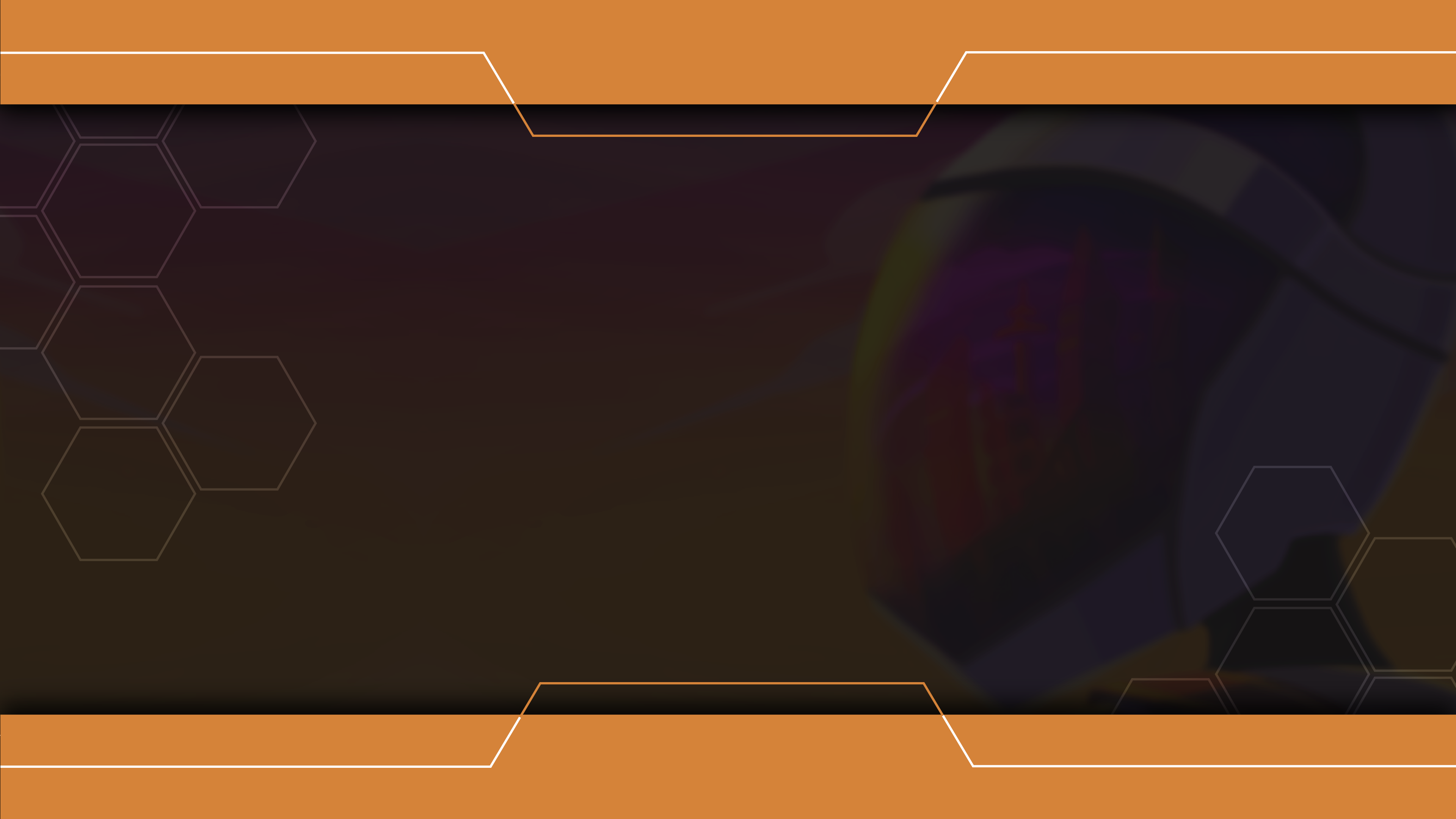
Episode 1 (Intro page)
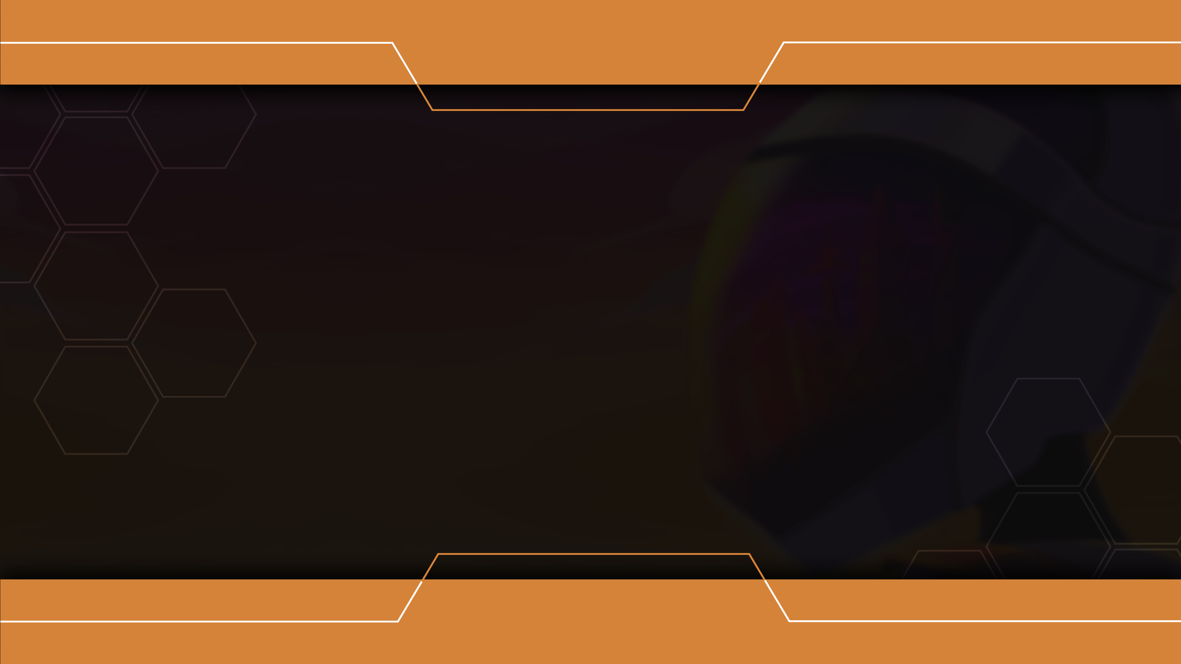
Episode 1 (Objective page) - Slightly dimmed
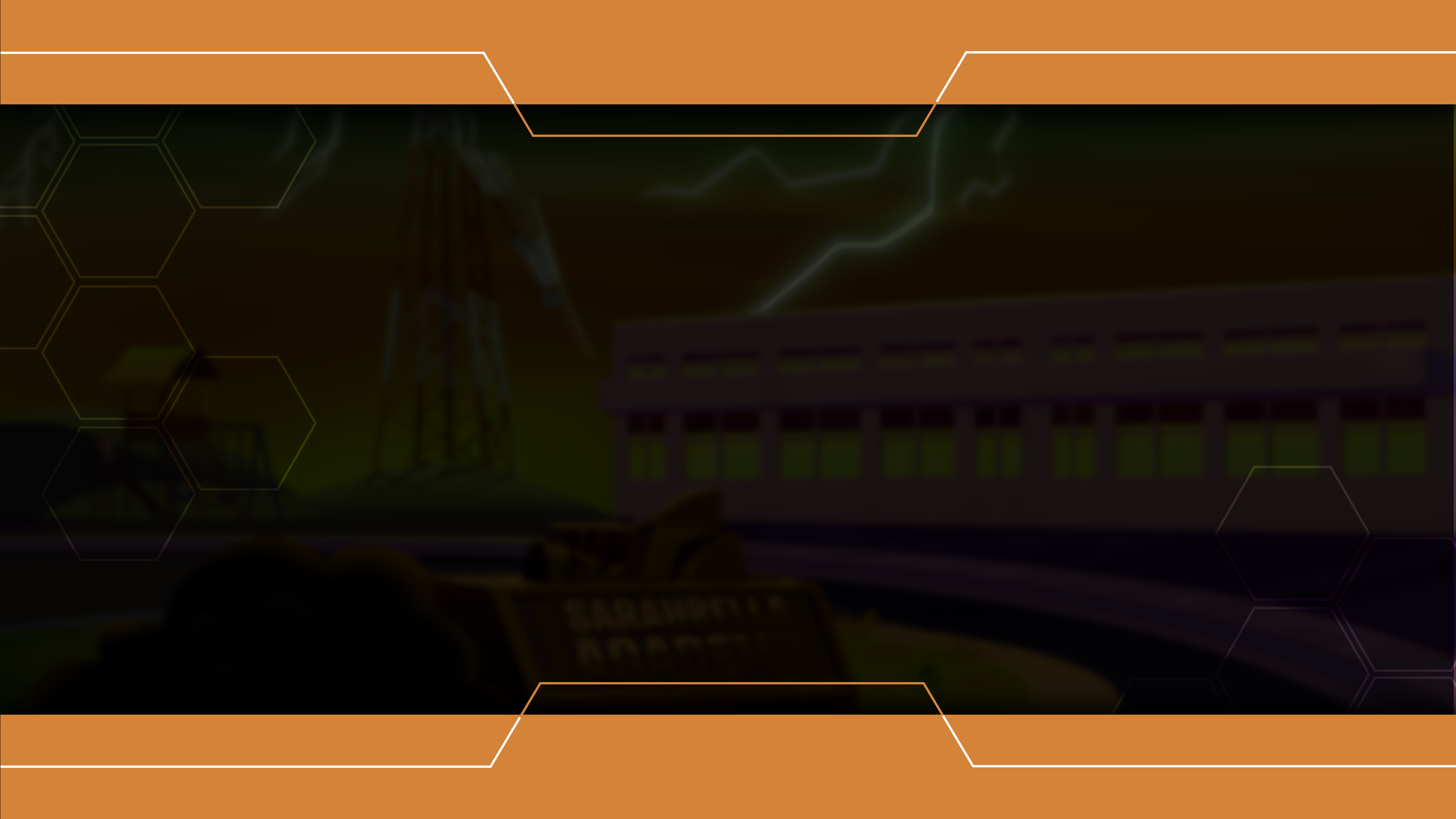
Episode 2 (Intro page)
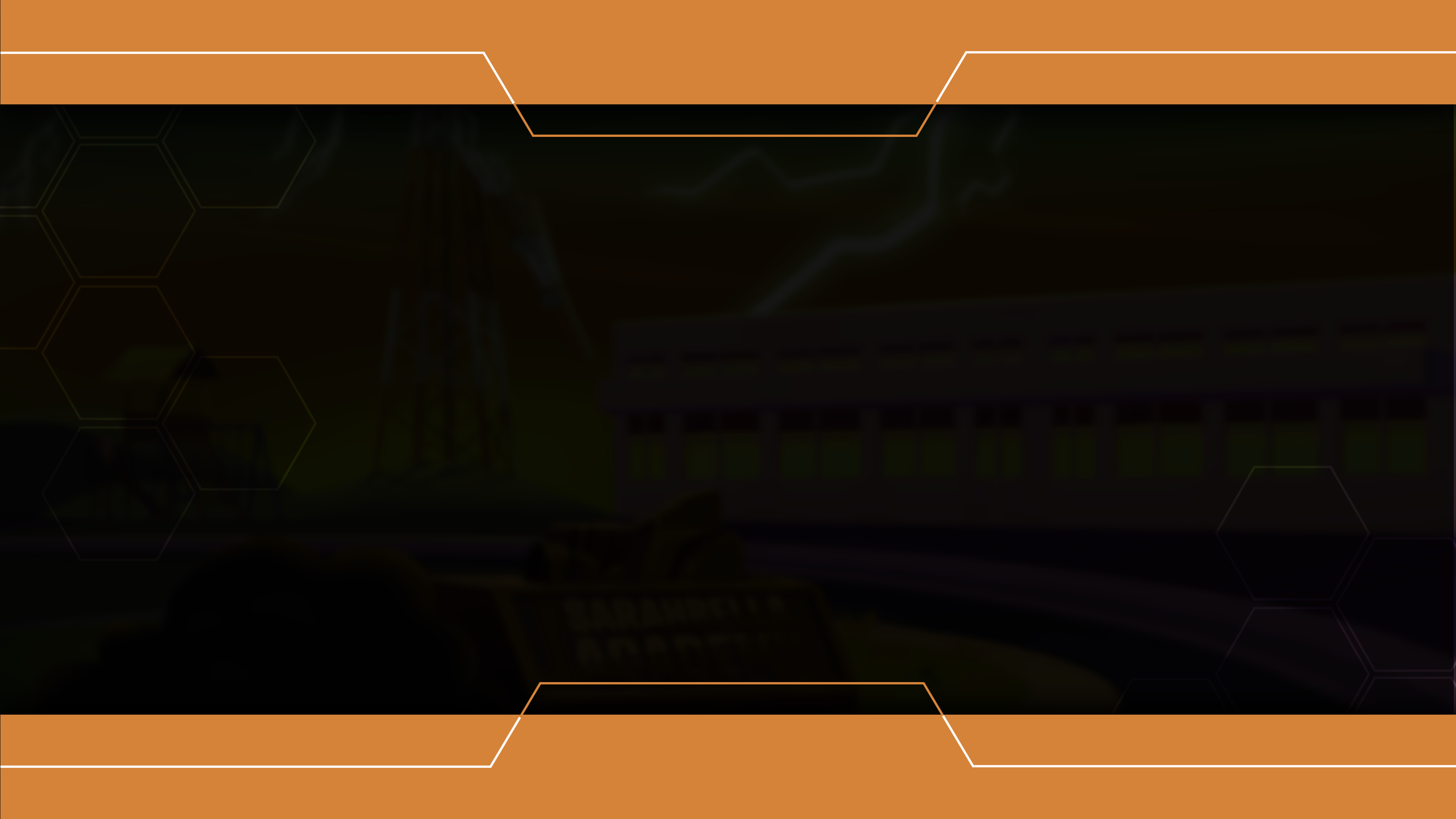
Episode 2 (Objective page)
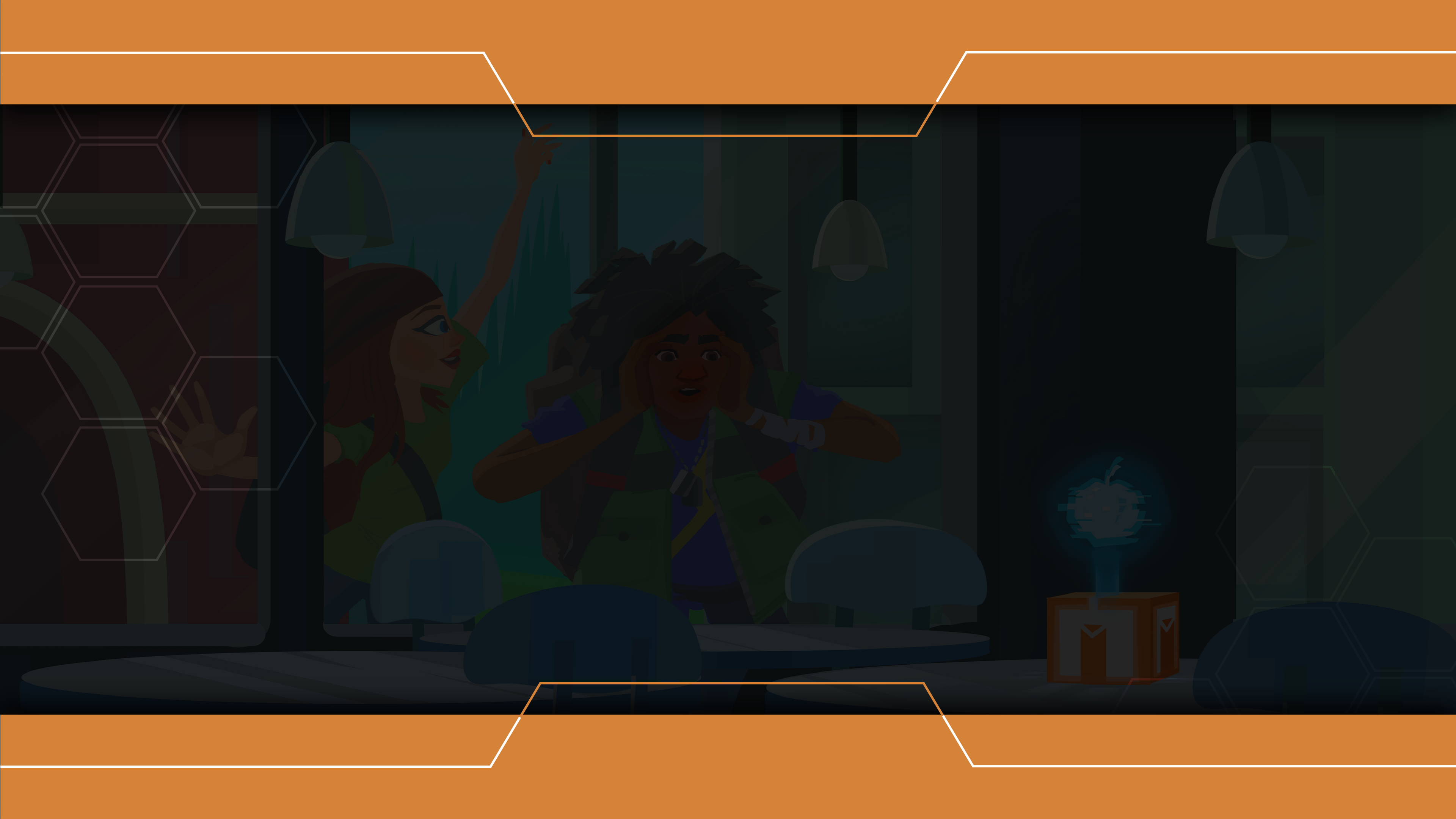
Episode 3 (Intro page)
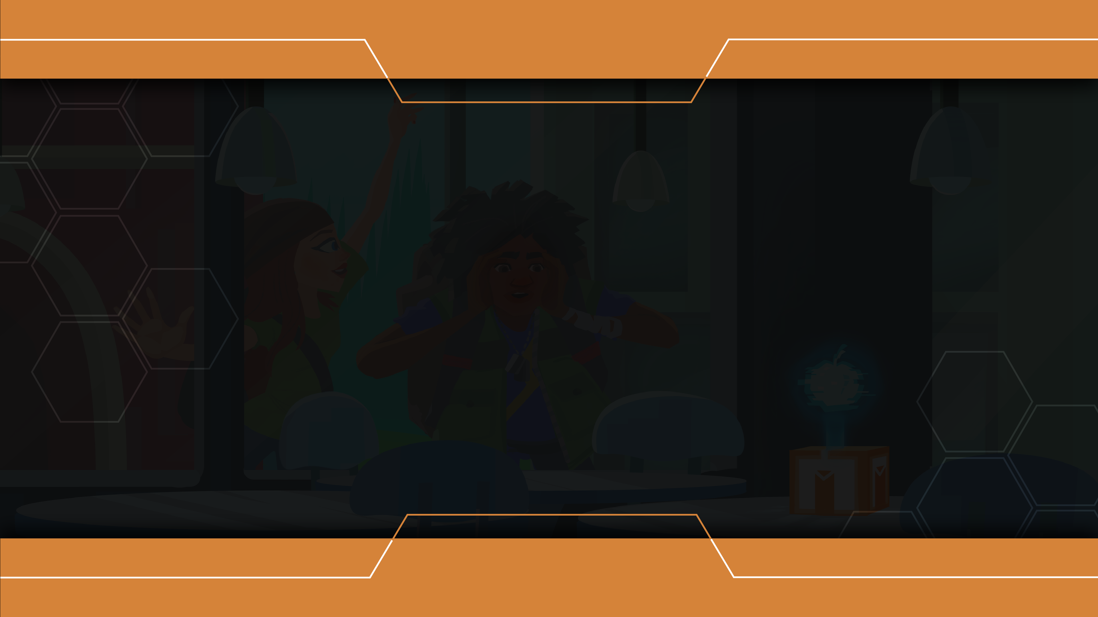
Episode 3 (Objective page)
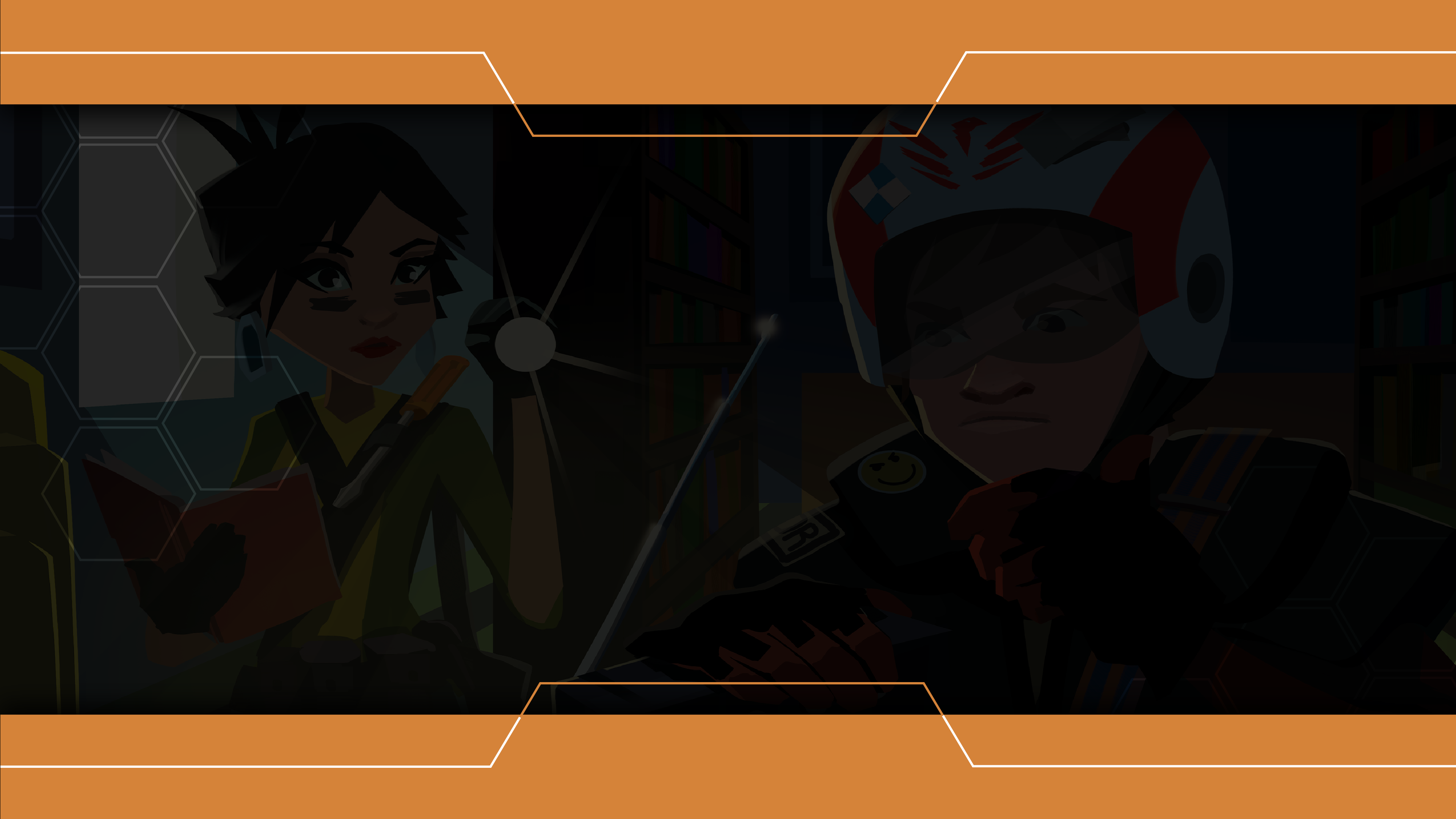
Episode 4 (Intro page)
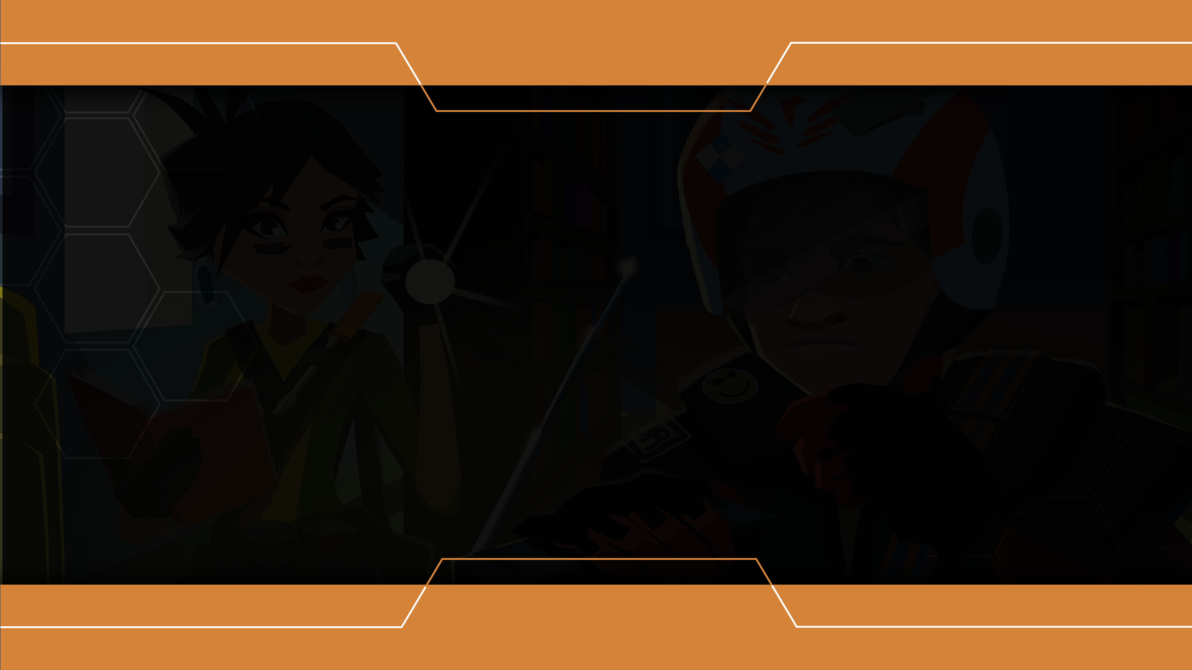
Episode 4 (Objective page)
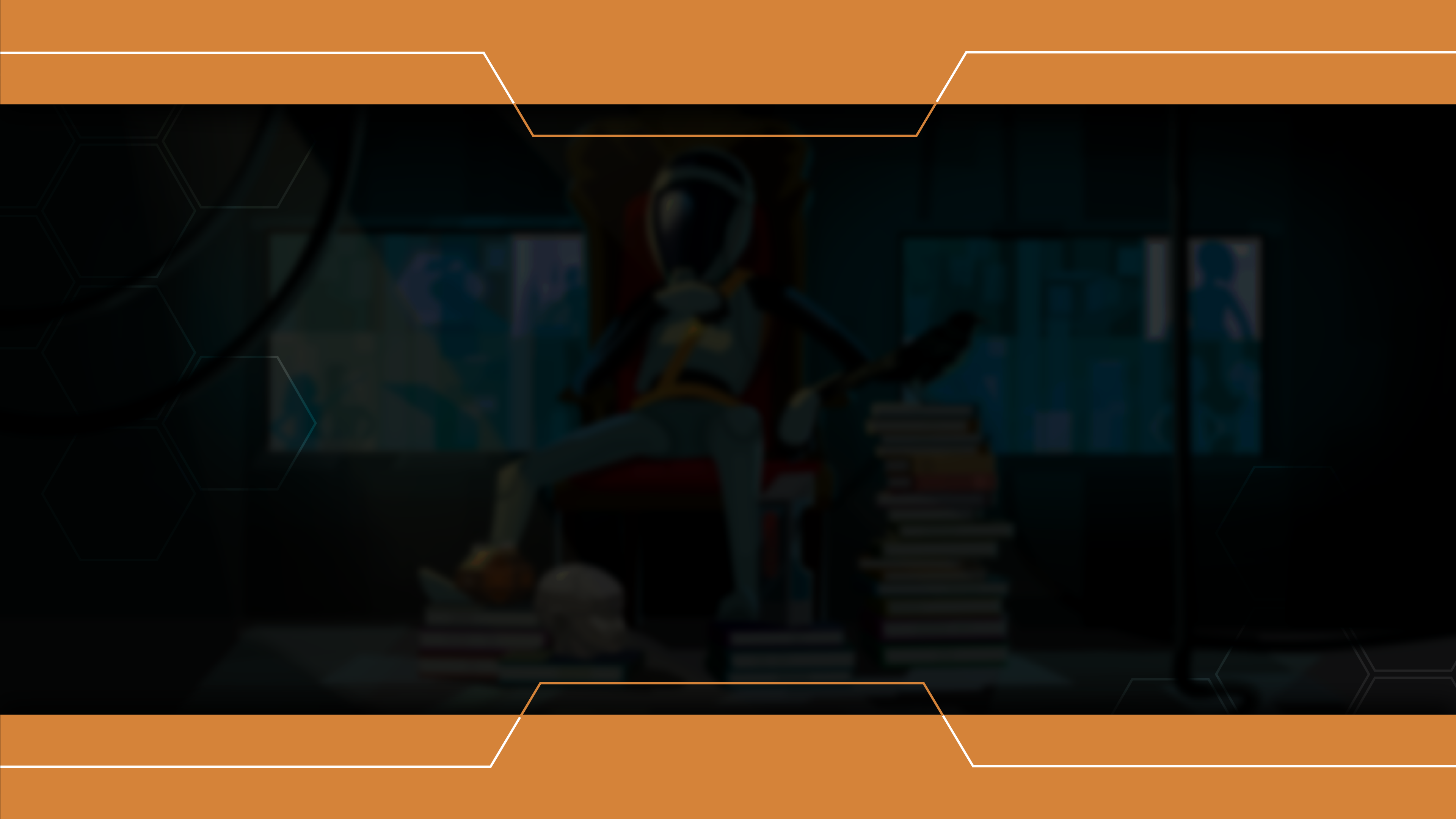
Episode 5 (Intro page)
Episode 5 (Objective page)
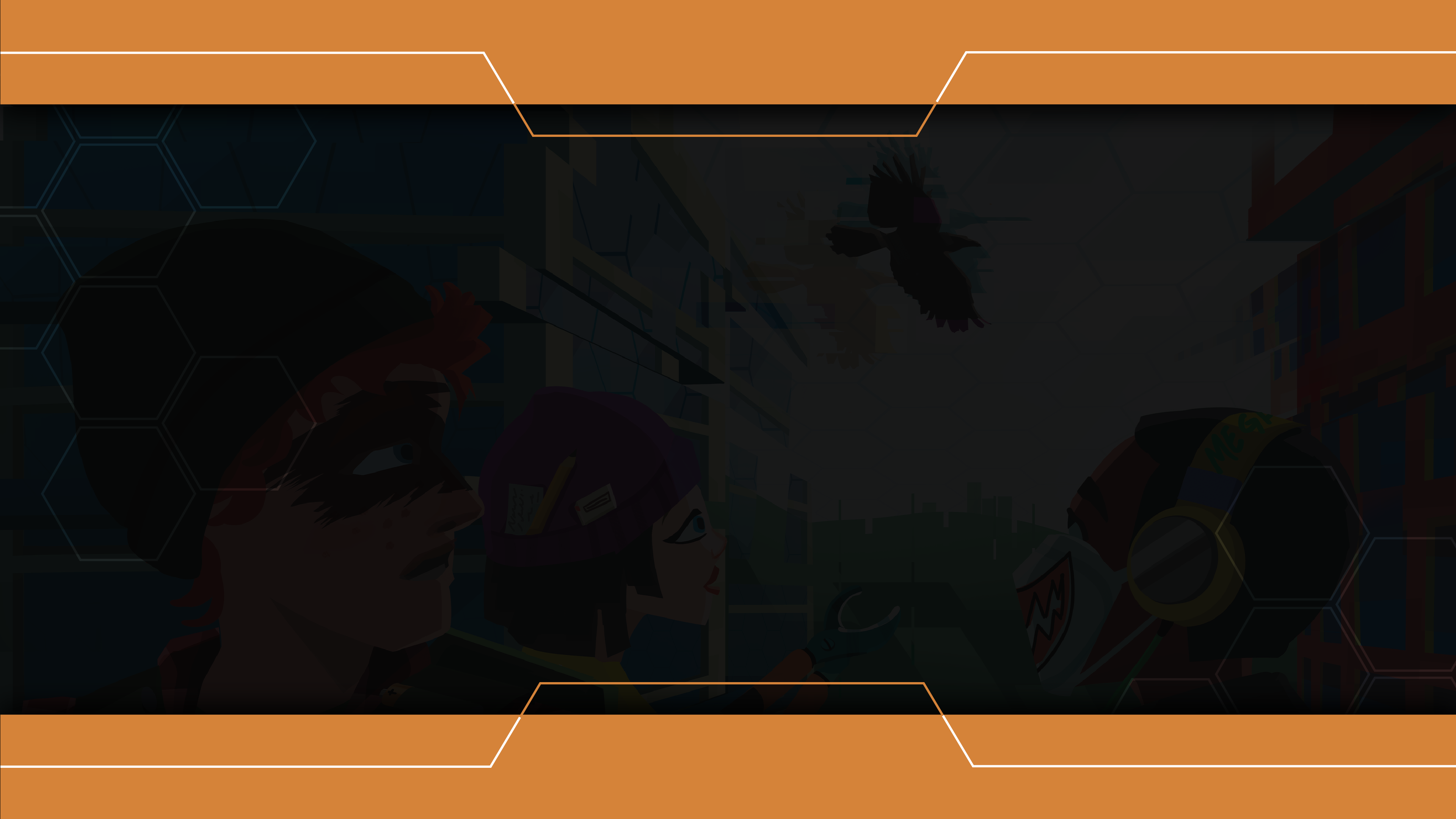
Episode 6 (Intro page)
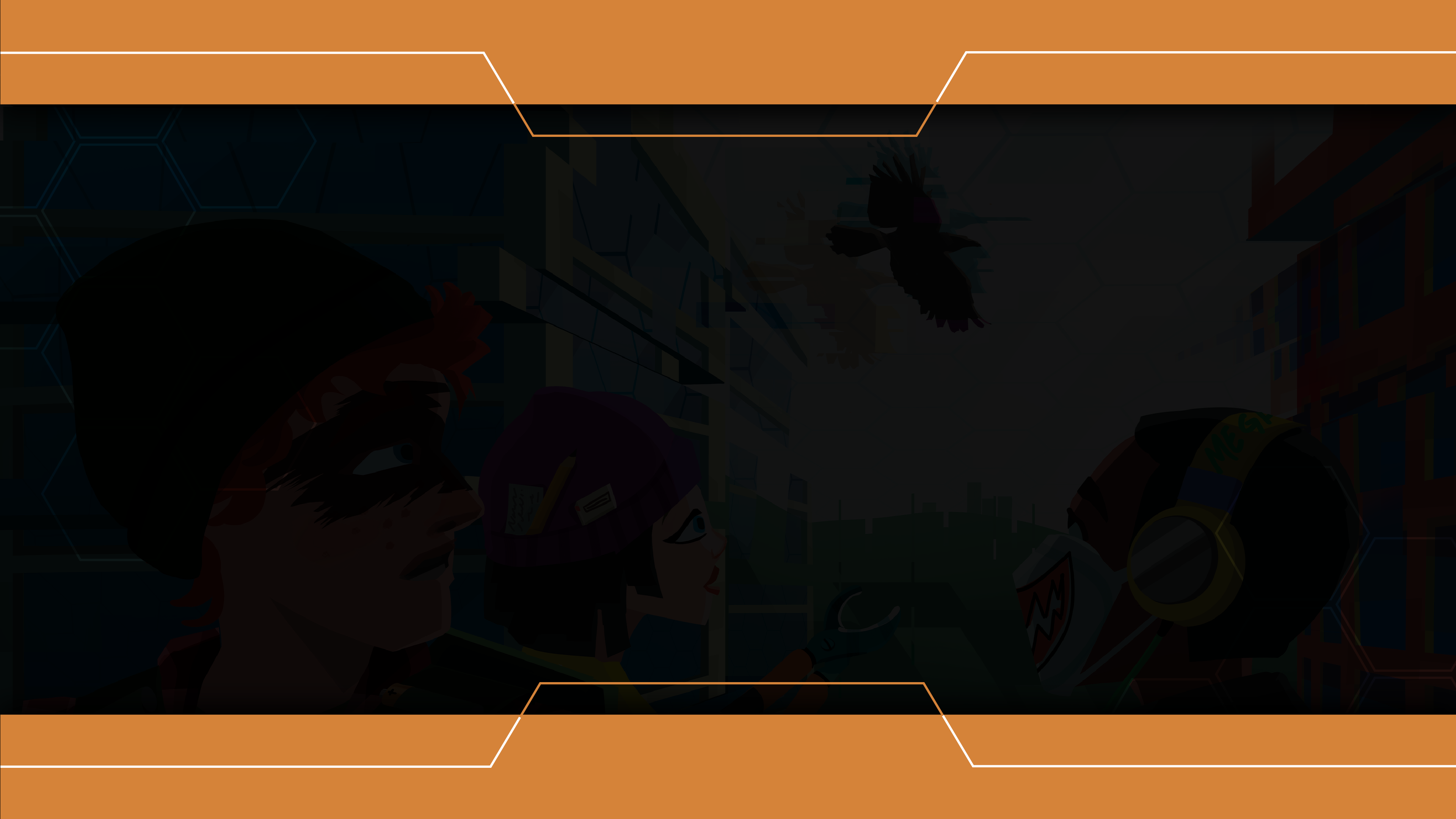
Episode 6 (Objective page)
Title pages for spot topics

regular pages for content
Below are the snippets of how the presentation slides look like with text
